How to fix the ugly font rendering in Google Chrome

Update, August 2014: Google has rolled out Chrome 37, which finally fixes this issue nativly. Yeah! For historical reasons the article below will stay online.
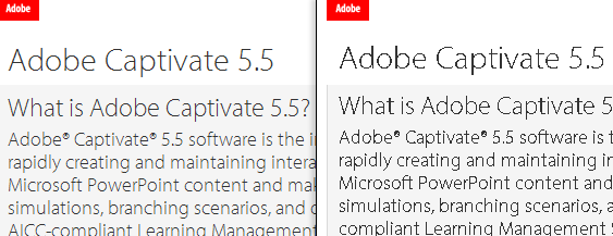
An image says more than thousand words:
This was indeed how a lot of webfonts (Google Webfonts and also highly professional fonts from Typekit etc.) looked in Firefox (left) and Google Chrome (right) on Windows systems (and eventually elsewhere too). No joke! To clarify this: The only browser that completely messed up Google Webfonts was Google’s browser Chrome. How sick is that ? In 2013 Opera browser has switched its rendering engine (to blink, thanks to the commenter for the notice), so this problem exists in Opera too.
But it gets even “better”! This bug is very well known to the Chrome developer team, and has been in fixing since July 2012. See the official bug report thread here: https://code.google.com/p/chromium/issues/detail?id=137692
To put this issue into some economical dimensions: Windows 7/8 is by far the most used operating system for web browsing. Google Chrome is the most used browser on those systems. Webfonts are used on an extremely increasing amount of mainstream websites. This issue affects millions of websites and probably 30-50% of all website-browsing internet users.
Update, June 2014: This issue will be fixed with Chrome 37 (which will be released around July/August 2014)
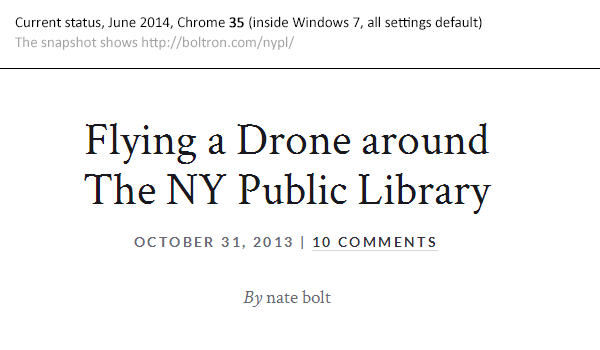
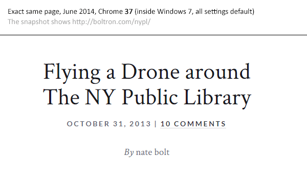
The Google Chrome dev team has finally fixed this issue and will release it to public with Chrome 37 in July/August 2014 (the date is a rough estimation). Currently, in June 2014, Chrome 35 is the rolled-out version. Here’s a comparison of the current Chrome 35 and the same page in the development version of Chrome 37. You can download Chrome 37 (WARNING! It’s an early preview, not a stable browser!) here.
Update, May 2014: Chrome’s dev team fixed this in Chrome 37
Good news: According to the official bug report’s comments this issue is fixed and will be released with Chrome 37 (around July 2014). A big thanks to all the people commenting and writing on this!
Personal note:
This article gets a lot of attention and has grown quite much, therefore I’ll reorganize the whole blog post when there’s time. Sorry for the unstructured post.
Status February 2014
In February 2014, there’s NO PERFECT fix for this, but there are some possibilites to make the fonts look much better, see below for some detailed possible workarounds. The results are totally different for each font, font-source (.ttf, .svg, etc.), font-size (!) and custom Windows font rendering settings (it’s not Microsoft’s fault by the way).
Chrome’s font-rendering is bad by default, even the Google Chrome Web Store, which is integrated into Google’s Chrome by default, using Google’s Webfonts, renders pixelated, while all other browsers render Chrome’s Webstore beautifully. When setting the font to a native one (directly loaded from the operating system) it’s the same.
[Screenshot from Chrome’s native Web Store app, showing Open Sans font]
[Screenshot from Chrome’s native Web Store app, showing Arial font]
Quick solutions
- Paragraph text in the 10px – 15px area usually looks totally okay, but gets more and more pixelated at larger sizes. At a certain size, from 50+px on, the fonts look much better again. Weird. Use this to workaround.
- See the font order “solutions” below. They might work, but definitly don’t work in lots of cases
- See the text-stroke fix below. This can look very ugly, but also hide the problem in some cases. It’s worth a try.
- If you present websites at your client/customer, do this on every other browser than Chrome :) or use a Mac / Linux. This might prevent very weird discussions.
- If your client/customer knows about this issue and forces you to fix it: Send a nice notice with the official Chrome bug report. This bug is simply totally beyond our control. If one of the richest companies in the world can’t fix it, then we should accept this in some kind of way.
- Using a font-replacement tool / service will do the job too. This is a step backwards in web development, but it solves the problem and might prevent stress with the client / customer.
Live demo
Fontspring’s demo font rendering site, useful for testing around with different font sources and for problem replication:
http://www.fontspring.com/demos/svg-vs-woff/
Current state of font-file support
Looks like TTF will make the game:
http://caniuse.com/fontface
http://caniuse.com/ttf
Important notice:
Make sure you DON’T have the specific font(s) installed on your local machine when developing locally
Because this will break your neck. When a user already has the specific font installed on his/her machine, then most browsers will load the local font instead of getting it “again” from the internet. I’m totally insecure about this issue (and haven’t had the time to read into this further), but Chrome 31 and Firefox 27 definitly render a local .ttf when instead a remote .svg is request by the HTML and the font-name is exactly the same (on Windows machines). I could reproduce this.
[wp_ad_camp_2]
Updates December 2013
1.) Possible solution #3: Near-crossbrowsersafe support for TTF/OFT now!
It looks like TFF/OTF are extremely good supported now (http://caniuse.com/ttf). This is cool when you self-host your fonts, but does not solve the problem when getting fonts via @import etc. from Google (like most people do).The problem is (like described in the next paragraph) that Google’s WebFont API delivers a .woff file (which renders shitty) instead of .ttf. I came accross the awesome TTF/OTF-support via the excellent comment made by Pablo Carrau (thanks man!) below this article:
I’ve found that the best solution is to get rid of the .svg and .woff formats and just leave the .eot and .ttf formats. This also fixes the same rendering issues on Safari. It then renders nice and smooth just like Firefox and IE.
2.) A look into what the Google Webfonts API really delivers to the Chrome browser: a WOFF file. Shit.
Let’s try this little example here: This code is a totally reduced example of how to request a webfont via the Google Webfont API, in the way Google recommends in the first place (in fact a JS-solution would load the page faster, but show the font later). Copy & paste to test by yourself and open it in the Chrome browser.
<!DOCTYPE html>
<head>
    <meta charset="utf-8">
    <link href='http://fonts.googleapis.com/css?family=Crimson+Text' rel='stylesheet' type='text/css'>
    <style>
        p {
            font-family: "Crimson Text";
            font-size: 30px;
            font-style: normal;
            font-weight: 600;
            margin: 100px;
            /* Uncomment this line to smoothen the font in Chrome a little bit */
            /*-webkit-text-stroke: 1px rgba(0, 0, 0, 0.4);*/
        }
    </style>
</head>
<body>
    <p>Grumpy wizards make toxic brew</p>
</body>
</html>
Via Chrome’s Web Developer Tools we can see how the response of
http://fonts.googleapis.com/css?family=Crimson+Text
really looks like (if the image is to small: click it):
So Google delivers a simple CSS rule-set that loads a remote .woff font. As far as I know there’s no possibility to request a specific file format. Such a function would be really cool! Please comment if you think you can give more info on that, maybe there IS a possibility to request specific file formats…
Update, November 2013: Solution #1 (when self-hosting the fonts): Additional css-rule to load .svg from Chrome
There’s a nice fix for the entire webfont rendering issue that obviously really does the job, but you’ll have to host the font-files by yourself. To create these .eot, .woff and .svg files from Google Webfonts, download the .tff from Google Fonts (there’s a download button in the upper right corner) and convert it to all the different formats using The Fontsquirrel Webfont Converter. Or simply use the ready-to-go font-sets on Fontsquirrel, for most open-source fonts they are available, check this OpenSans example (select Webfont Kit on the purple right navigation).
To my surprise this solution has been posted on the web already in early 2012 (!), but no-one noticed. The related question/answers [here] on StackOverflow took more than 40.000+ visitors until one person come up with this solution.
The way to go is to simply add an additional media query for Chrome:
/* this is how a font-face rule usually looks like */
@font-face {
    font-family: 'MyWebFont';
        src: url('webfont.eot'); /* IE9 Compat Modes */
        src: url('webfont.eot?#iefix') format('embedded-opentype'), /* IE6-IE8 */
	     url('webfont.woff') format('woff'), /* Modern Browsers */
	     url('webfont.ttf')  format('truetype'), /* Safari, Android, iOS */
	     url('webfont.svg#svgFontName') format('svg'); /* Legacy iOS */
}

/* the fix ! simply ADD this block BELOW the above block */
@media screen and (-webkit-min-device-pixel-ratio:0) {
    @font-face {
        font-family: 'MyWebFont';
            src: url('webfont.svg#svgFontName') format('svg');
    }
}
Voila! Big thanks to Jaime F. for his excellent answer on StackOverflow, find the original solution [in spanish] here in his blog article.
[wp_ad_camp_2]
Update, November 2013: Solution #2 (when self-hosting the fonts): Change the font loading order, so .svg comes before .woff
Fontspring.com has an own solution. They simply change the order of the font files, so SVG comes before WOFF (which is the standard rendering in most modern browsers): But you’ll have to host the files on your server. To create these .eot, .woff and .svg files from Google Webfonts, download the .tff from Google Fonts (there’s a download button in the upper right corner) and convert it to all the different formats using The Fontsquirrel Webfont Converter. Or simply use the ready-to-go font-sets on Fontsquirrel, for most open-source fonts they are available, check this OpenSans example (select Webfont Kit on the purple right navigation).
@font-face {
    font-family: 'MyWebFont';
        src: url('webfont.eot'); /* IE9 Compat Modes */
        src: url('webfont.eot?#iefix') format('embedded-opentype'), /* IE6-IE8 */
             url('webfont.svg#svgFontName') format('svg'),
	         url('webfont.woff') format('woff'), /* Modern Browsers */
	         url('webfont.ttf')  format('truetype');
}
How solution #1 and #2 look when done
This is a real screenshot of exactly this site :) performing the above css trick. Note that the ugly edges of the fonts look better, but in general it’s still no comparison to the beautifully rendered fonts in Firefox, Safari and Internet Explorer.
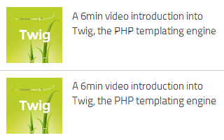
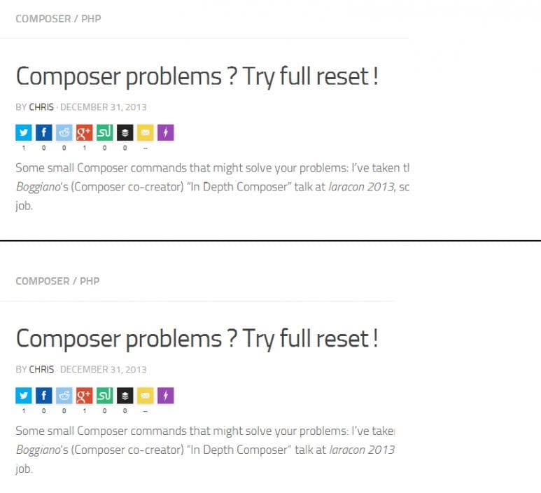
Top: Font “Titillium” loaded remotely via Google Web font API. Browser renders .woff font.
Below: Font “Titilium” self-hosted and applied the above font-change order fix (solution #1). Browser renders .svg font.
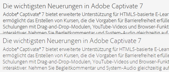
Top: Font “Titillium” loaded remotely via Google Web font API. Browser renders .woff font. Note the weird rendering of “Depth”.
Below: Font “Titilium” self-hosted and applied the above font-change order fix (solution #1). Browser renders .svg font.
Update, November 2013: Some fonts still messed up with Chrome 30
This is a comparison of a highly professional theme using an official Google Webfont (Crimson), as rendered in Chrome 30 (top) and Firefox 25 (bottom). Awful. No special settings, no plugins, just pure defaults in the OS. Please note that the font looks a little bit cheesy in Firefox too. The totally different line break behaviour is also interesting.
Update, August 2013: Seems to be PARTLY fixed, but still horrible in some cases…
This blog post is an addition to my answer on StackOverflow on exactly that issue [“Is there any font smoothing in Google Chrome ?“], and obviously this bug has been fixed in a recent version of Chrome, after one year in progress. See some screenshots below, all made with Firefox 23 and Chrome 29, all Windows font settings at default. However, the rendering of Google Webfonts sometimes still looks better in Firefox, especially with larger font-sizes. Weird!
Left: Firefox 23, Right: Chrome 29
Looks the same. Rendered font is “Monaco”.
Top: Firefox 23, Bottom: Chrome 29
Clearly NOT the same at higher font sizes.
Top: Firefox 23, Bottom: Chrome 29
Soft differences, but they clearly fixed something (compared to the first image in this article).
CSS fixes to make font rendering look better in Chrome
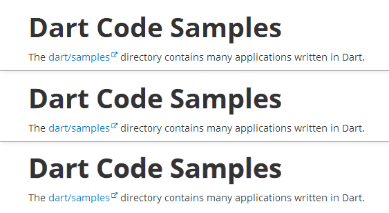
This looks good so far, but as you can see in example #2, fonts can still look edge and very unsmooth in Chrome. Have a look at the headline of https://www.dartlang.org/samples/, a site by Google [Screenshot from August 2013, in Chrome 29, Windows 7 with default font settings]:
Let’s fix this! The most common way to do so is giving the text a -webkit-text-stroke rule.
First image:
default, no -webkit-text-stroke rule
Second image:
-webkit-text-stroke: 0.3px;
Third image:
-webkit-text-stroke: 0.6px;
Oh yeah! This indeed “fixes” the issue quite much. The font looks heavier, but much smoother. If the 0.Xpx stepping is too big for you, try the RGBa syntax, which gives you the possibility to include alpha-transparency:
-webkit-text-stroke: 1px rgba(0, 0, 0, 0.1);
There’s also an outdated solution, but with the -webkit-text-stroke rule this will not be necessary anymore:
text-shadow: #333 0px 0px 1px; // for dark text
or with RGBa syntax:
text-shadow: 0 0 1px rgba(51,51,51,0.2); // find your own color/alpha settings
These are just examples, you need to find your own settings matching your text color, background color, font size etc.!

