Redesigning Windows 8 – fantastic and clever drafts by Jay Machalani

The interface of Windows 8 has been the topic of heated discussions for a long time now, and everybody who’s is familiar with common desktop operating systems asked the same question: “What the fuck ! Where is the start button ?” – Windows 8 has introduced the biggest – and worst – change in the history of mainstream user interfaces. Beside the total lack of any logical reason for doing so, it’s even weirder when you realize that the Metro UI is clearly designed for small resolutions, difficult light situations, quick eye response and human fingers. It’s clearly made for mobile devices, not for desktop systems.
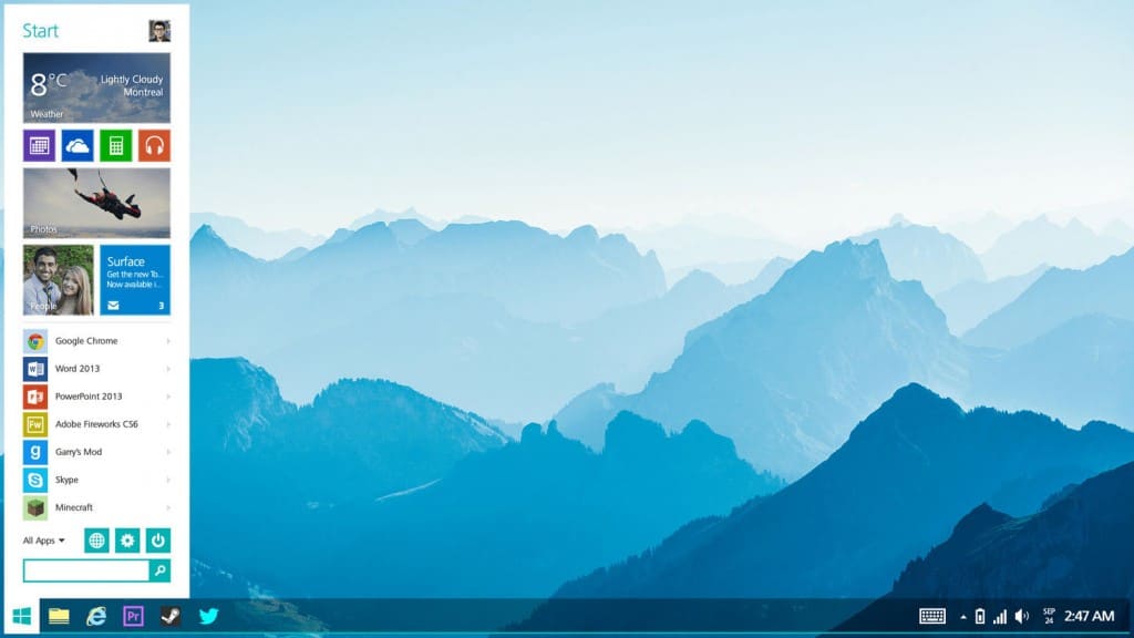
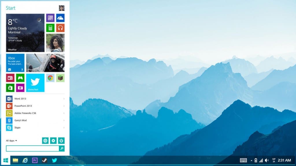
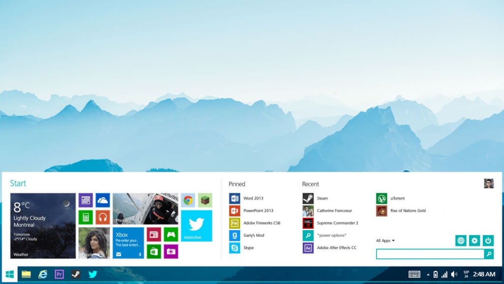
Anyway, UI/UX expert Jay Machalani has published excellent drafts for a potential, inofficial new Windows 8 / Windows 9 start menu: A clever, clean, useful and perfectly fitting approach on the start menu. Even more, he has written and recorded excellent thoughts on a redesign and restructuring of the entire Windows 8 interface. Highly recommendable stuff!
Also check out this 3-part series, giving some very interesting insights into the Windows 8 / Windows 9 interface problems – and possible solutions.


